
Neighborhood Mercato
Project Background
Neighborhood Mercato is an online Italian Market that carries popular and hard to find specialty items made in Italy. While it is hard in certain states to get the specialty products you want, Neighborhood Mercato is making it easy for people to access them whenever and wherever they need.
The Challenges & Goals
Research the current market and find out who the competitors are
Offer hard to find items at the best prices, all on one convenient website
Design a responsive website and clean interface for all platforms and sizes
Identify if any user errors are occurring and find solutions to avoid them
Target Audience
Busy shoppers of all genders and backgrounds who want to purchase hard to find Italian products all on one convenient and easy to use website.
User Persona - Sid Rosa
Sid, is a 48-year old full-time employee who moved to California from New York City. He is frustrated that he cannot find all of the products he use to have access to at all the Italian Markets in NYC. Sid is also not internet savvy and finds searching websites difficult and gets easily confused by complex websites. When he did find the items he wanted online, the prices and shipping were extremely higher than he was use to paying. Sid would like to see a website that is easy to navigate with minimal design and offers competitive pricing, making his user experience a positive one.
Research & Insights
We conducted interviews with users and turned what we learned into actionable steps. We used the insights we discovered to identify the following pain points our users were experiencing. All of these adjustments made the browsing experience more enjoyable, which helped meet the user’s needs.
Users wanted another option to go backwards other than clicking on the back button on the browser so we added a back button and a breadcrumb menu to each page
Users also wanted an add to cart button from the overview product page, as opposed to having to click into each individual product to then add to your cart
There were too many steps for checkout so we eliminated a page in the checkout process to shorten the tasks a user needs to go through in order to complete a transaction
We need to be competitive with our prices and shipping options
Initial Wireframes
First round wireframes for a lo-fi prototype.
Below you will see some changes made between the lo-fi and hi-fi prototypes.
The 3 key updates made were as follows.
Add another option to go backwards with a breadcrumb menu to each previous page.
Add a “add to cart” button from the overview product page.
Eliminate a page in the checkout process to shorten the tasks a user needs to go through in order to complete a transaction.


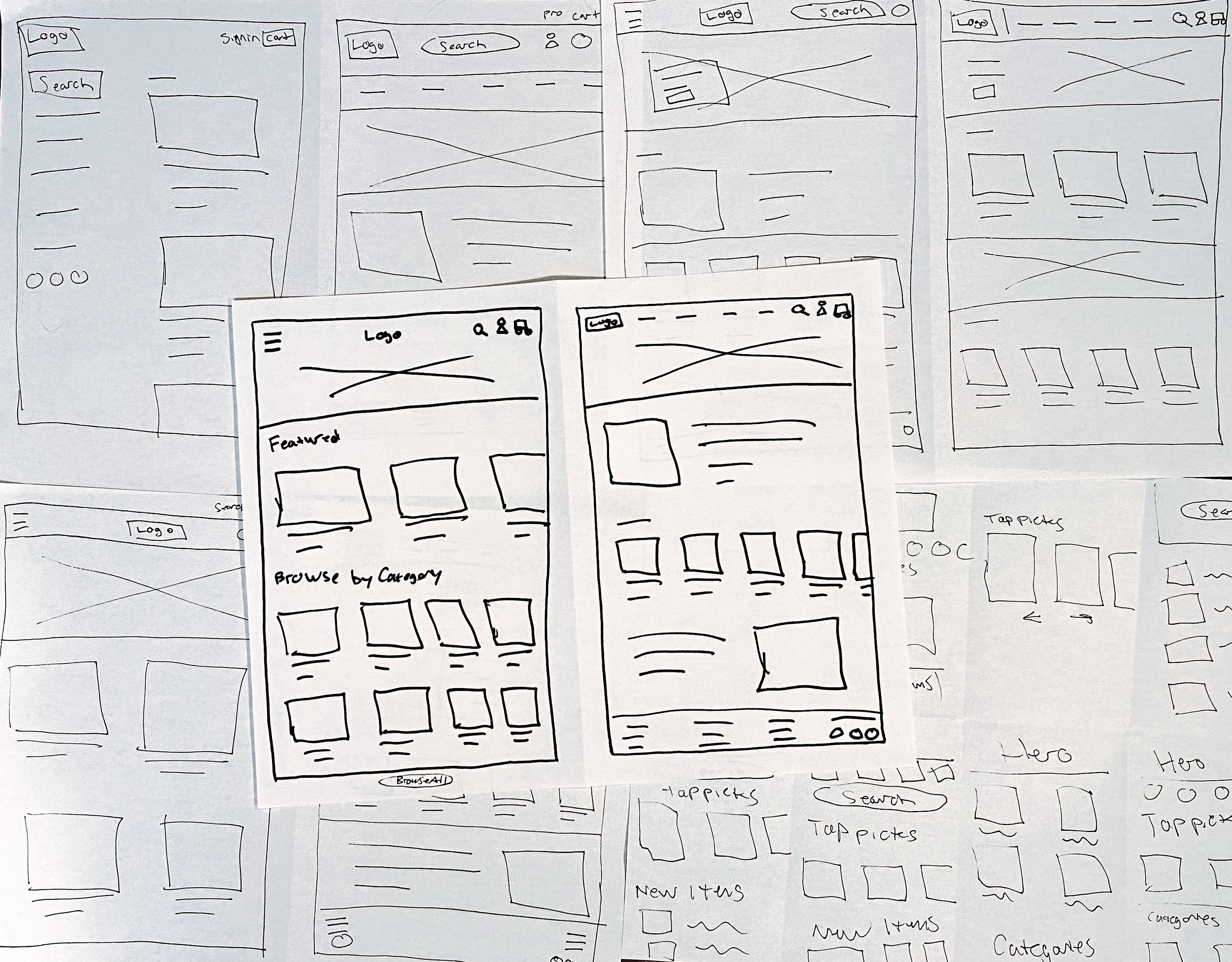
Sketches
Usability Study
Study type: Unmoderated usability study
Location: United States, remote (each participant went through the usability study in their own home)
Participants: Five participants, each completing the study individually
Length: Each session had 10 minutes, based on a list of prompts
Results: Most users were satisfied with the flow and ease of use of the website. 1 recommendation was to add a home link to the nav bar incase users do not know that they can click on the logo to get home. Another user thought the red was a little bright for their taste, so we did darken it a little bit to help users sensitive to color. Overall, the website was well received and we are going to proceed to build the website and launch the online market.


Accessibility Considerations
The color palette was run through WebAIM to pass accessibility standards
The images on each page use al text to allow a screen reader to read the content
Takeaways
While working on a responsive website, I realized it was a bit more complicated designing for a smaller website screen, as opposed to designing specifically for a phone app. I learned a lot about the process and gained some key knowledge from testing out the site that I will be sure to apply and considering when working on responsive websites in the future. I am excited to get this whole website built and launched in the near future and look forward to another round of user testing when it is live.